The charts and maps that explain the state of the pandemic in Austria
Here's a brief look at the state of play in Austria using graphs and maps as the country sees a surge in new Covid-19 infections.
The overall state of play
According to the European Centre for Disease Prevention and Control, Austria has reported a total of 57,762 cases of Covid-19 since the pandemic began, although the real number is likely higher given the problems with testing.
That number includes 13,155 cases in the last two weeks up to October 15th.
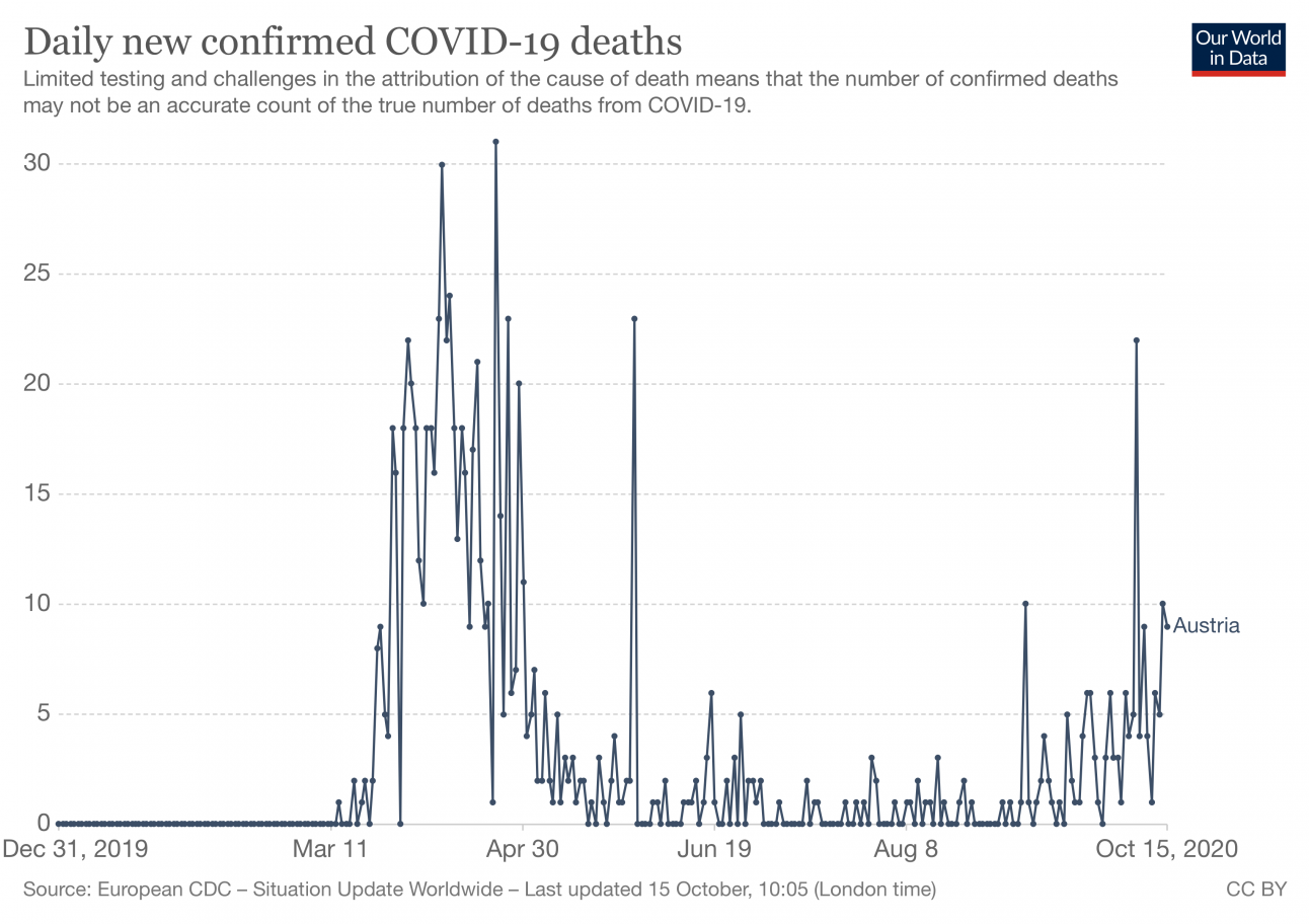
There has been 879 deaths linked to Covid-19 infections in Austria wince the pandemic began.


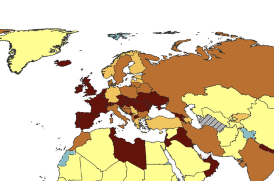
Around Europe
The below map shows the infection rate per 100,000 people over the last two weeks. The rate in Austria is among the highest - that is to say over 120 cases per 100,000 in the last two weeks.
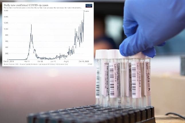
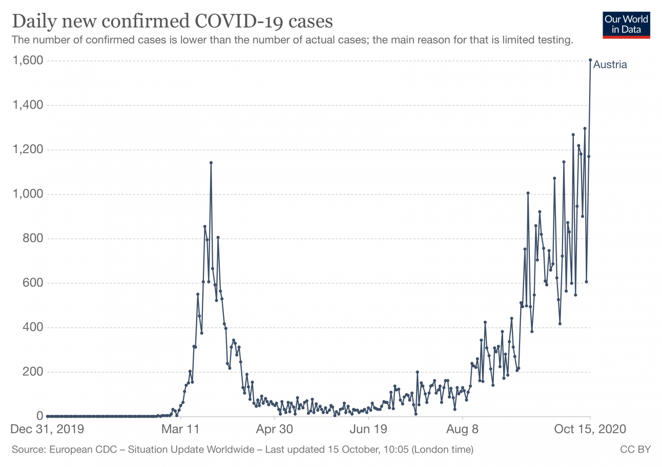
New coronavirus cases
The chart shows the number of confirmed daily cases since the pandemic began. Although it's important to note that far more tests are being carried out now than back in the spring, which obviously can affect the chart.
Coronavirus deaths
This chart shows the number of deaths linked to Covid-19 in Austria since the pandemic began.
 Testing
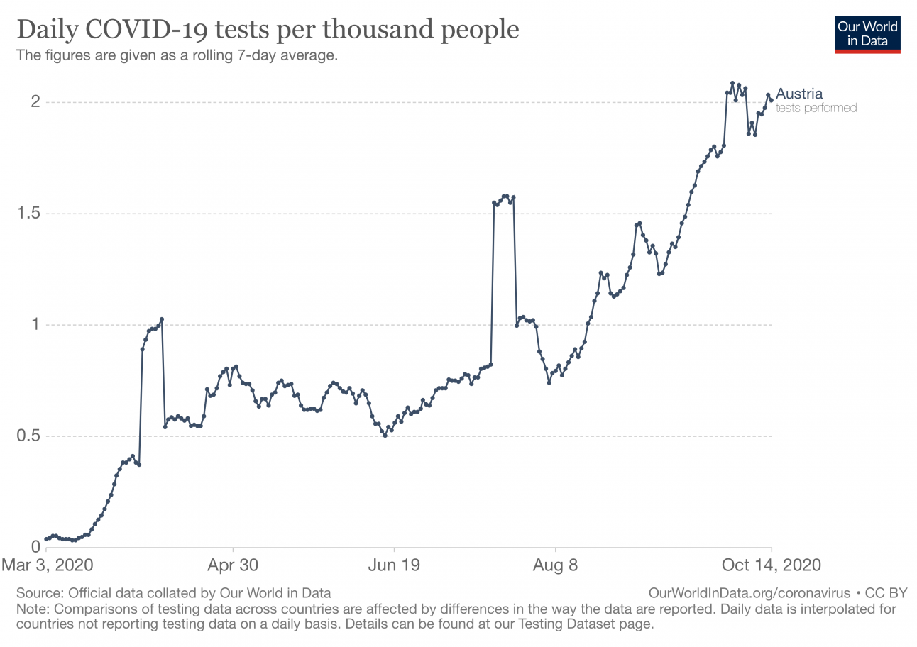
The chart below shows the number of tests carried out per 1,000 people in Austria since the pandemic began.
 Comparing Austria
The maps below allow you to compare the evolution of the virus in Austria over the last two weeks compared to elsewhere in Europe and around the world.
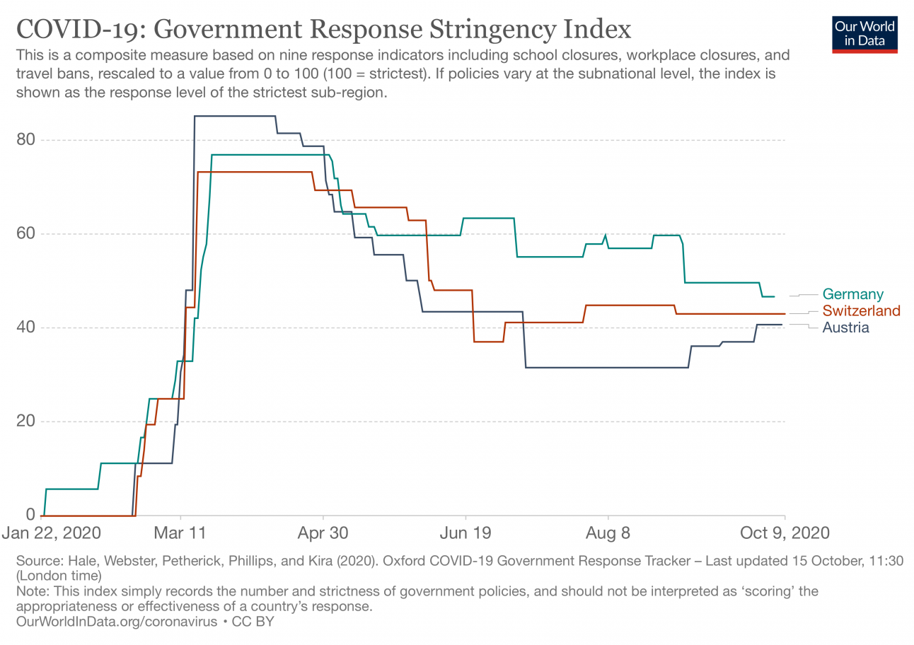
How strict has Austria been:
The chart below gives an idea of how strict the Austrian government has been in introducing measures aimed to stem the spread of the virus.
It shows how the governmental response has changed over time and the Government Stringency Index – a composite measure of the strictness of policy responses.
The index on any given day is calculated as the mean score of nine policy measures, each taking a value between 0 and 100.
The nine metrics used to calculate the Government Stringency Index are: school closures; workplace closures; cancellation of public events; restrictions on public gatherings; closures of public transport; stay-at-home requirements; public information campaigns; restrictions on internal movements; and international travel controls.
Here the Austrian government reaction is compared to that of neighbours Switzerland and Germany.
To view more charts, maps and graphs on Austria's Covid-19 situation you can visit Our World in Data.
Comments
See Also
The overall state of play
According to the European Centre for Disease Prevention and Control, Austria has reported a total of 57,762 cases of Covid-19 since the pandemic began, although the real number is likely higher given the problems with testing.
That number includes 13,155 cases in the last two weeks up to October 15th.
There has been 879 deaths linked to Covid-19 infections in Austria wince the pandemic began.
Around Europe
The below map shows the infection rate per 100,000 people over the last two weeks. The rate in Austria is among the highest - that is to say over 120 cases per 100,000 in the last two weeks.
New coronavirus cases
The chart shows the number of confirmed daily cases since the pandemic began. Although it's important to note that far more tests are being carried out now than back in the spring, which obviously can affect the chart.
The chart below shows the number of tests carried out per 1,000 people in Austria since the pandemic began.
The maps below allow you to compare the evolution of the virus in Austria over the last two weeks compared to elsewhere in Europe and around the world.
How strict has Austria been:
The chart below gives an idea of how strict the Austrian government has been in introducing measures aimed to stem the spread of the virus.
It shows how the governmental response has changed over time and the Government Stringency Index – a composite measure of the strictness of policy responses.
The index on any given day is calculated as the mean score of nine policy measures, each taking a value between 0 and 100.
The nine metrics used to calculate the Government Stringency Index are: school closures; workplace closures; cancellation of public events; restrictions on public gatherings; closures of public transport; stay-at-home requirements; public information campaigns; restrictions on internal movements; and international travel controls.
Here the Austrian government reaction is compared to that of neighbours Switzerland and Germany.
To view more charts, maps and graphs on Austria's Covid-19 situation you can visit Our World in Data.
Join the conversation in our comments section below. Share your own views and experience and if you have a question or suggestion for our journalists then email us at [email protected].
Please keep comments civil, constructive and on topic – and make sure to read our terms of use before getting involved.
Please log in here to leave a comment.